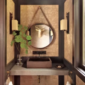
Choosing Your Colour Scheme for a Perfect Interior
Choosing your colour scheme can transform how you feel in a room, shaping its mood, size, and overall personality. Colours interact with both natural and artificial light, creating depth and enhancing the atmosphere. A change in hue can make a space appear bigger or smaller, while also influencing how warm or cool it feels. Combining the right colours with thoughtful design elements can give your interior a unique and inviting look.
How to Select the Right Colour Scheme for Your Space
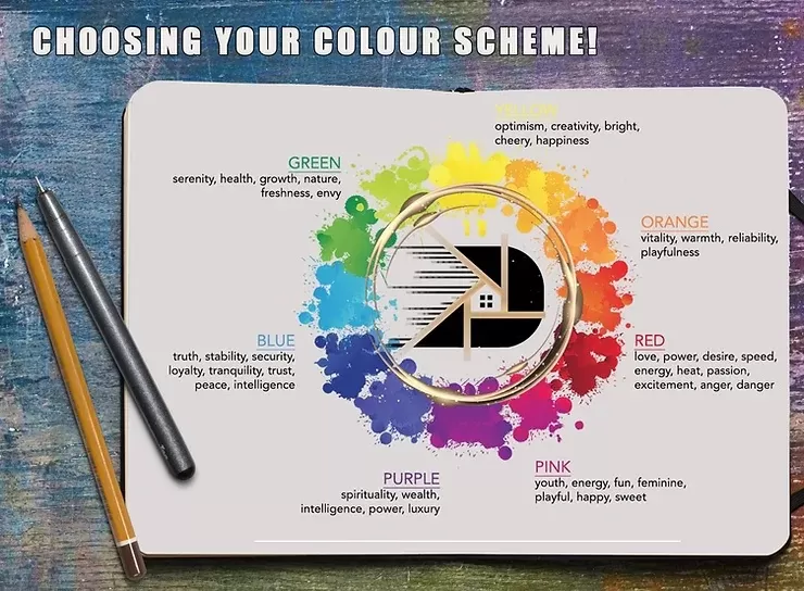
Warm colours like red, orange, and yellow create a friendly and engaging atmosphere. They naturally catch the eye, making them feel more personal and inviting. Adding tactile elements to a wall enhances their welcoming effect.
In contrast, cool colours such as blue and green evoke calmness and refreshment. Green symbolizes nature and peace, while blue is associated with tranquility. These shades make a space feel larger and lighter, creating an open and airy ambiance.
Warm colours, like yellow for joy or red for passion, convey positive emotions but can also reflect darker themes depending on their context. Bright warm tones contrast beautifully with darker cool tones, creating visual interest and making certain elements stand out.
Typically, warm colours bring design components to the foreground, while cooler hues anchor elements in the background. However, this isn’t a strict rule and can vary depending on the context.
The effect is a tone-on-tone look.
Using different quantities of white with the same colour tone will make the interior look more sophisticated and calming.
You can add different textures and structures to monochrome palettes to create an immediate depth effect without producing an overpowering visual effect. You can draw complex designs in many directions if you choose to do so.
Colour and light
Colour is a source of light. Colour is energy.
How we interpret colour in a space is significantly affected by light.
To make a room brighter, adjust the way the light is reflected, which can be achieved using 3D frames or panels to create an interplay between light and shadow.
Lighter colours make a room appear more prominent than darker colours, as opposed to dark walls which absorb light.
Colour can be tricky,
Colour is more than just pairs on the colour wheel. It can create moods and determine the identity of your space. You should think about how you use each colour and play with various patterns – as a backdrop, accent, or text.
Think about how tints and shades can bring effect and drama to suitable locations. Also, consider how each colour fits with its surroundings. In certain variations, each hue will take on its neighbors’ properties, almost producing a new hue.
You should wisely choose and implement the colour scheme for any space as it is the primary tool for understanding the space and its users in its entirety.